Not Your Average Joe's
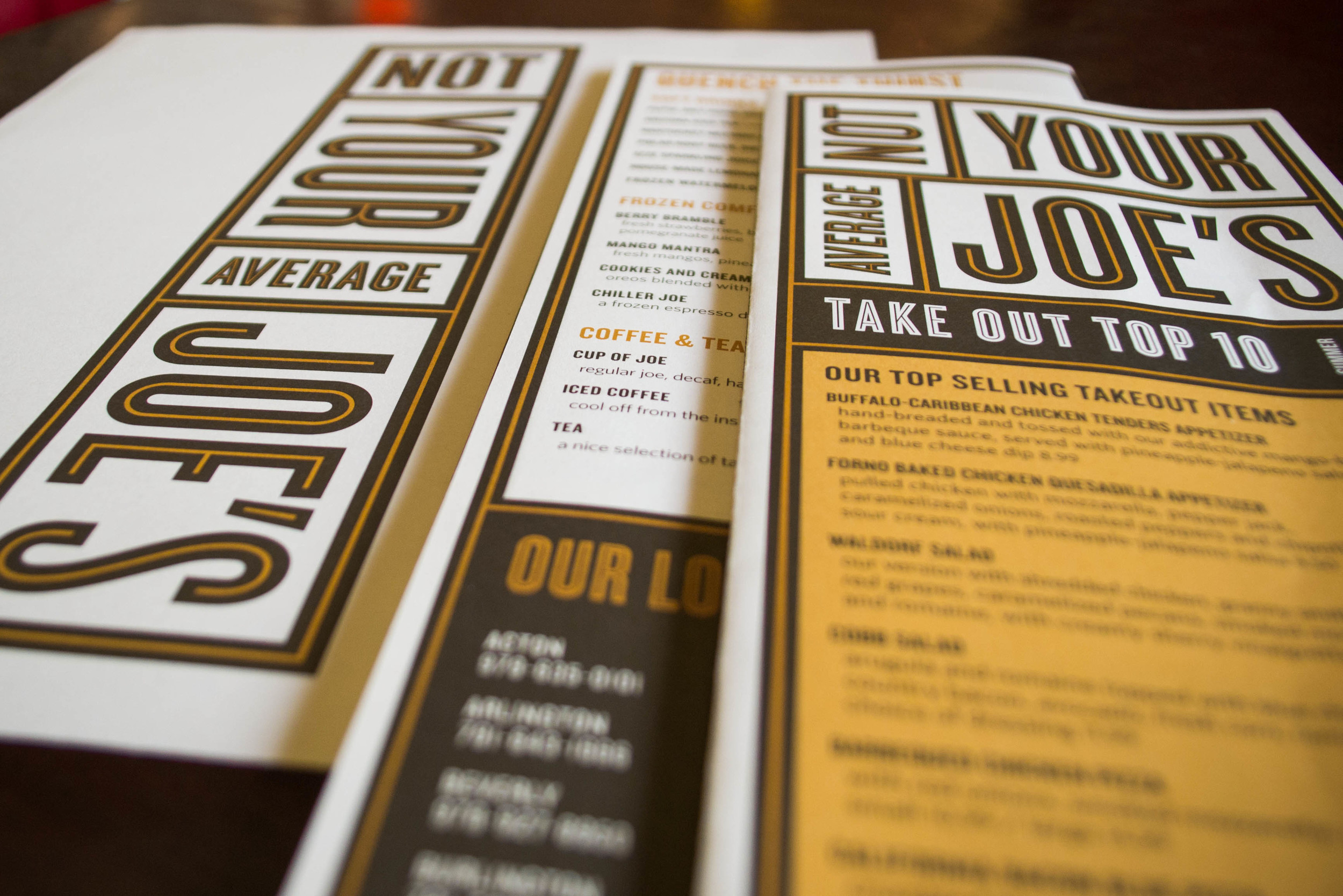
The new menu and website complement the compelling new visual identity that conveys Not Your Average Joe's unique casual dining experience and fresh cuisine. The new logotype, with it's interlocking frames, evokes the idea of fresh produce crates coming together — the base of a great meal prepared from scratch with fresh ingredients.
The new menu system, reformatted to be tall and narrow, not only compliments the logotype's verticality but also brings a more sophisticated touch to the dining table.
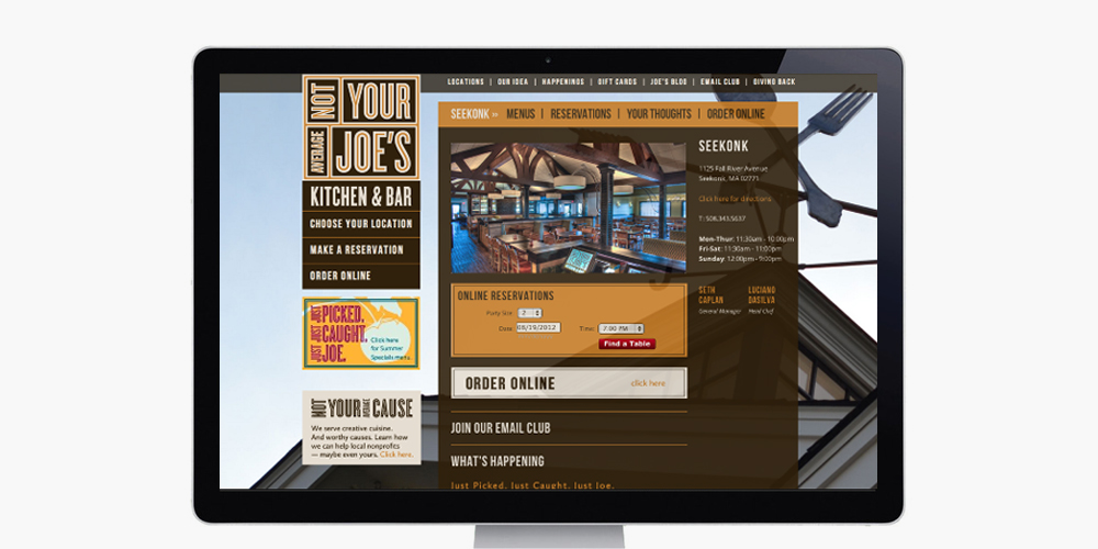
Through large immersive photography, the new website welcomes guests with open arms just like a visit to a local "Joe's." The emphasis was also to highlight that each restaurant location is individual and truly your "Your Joe's." With their own background images, each location can be celebrated for its unique characteristics.
Scope of work
- Website Design
- Menu Design
- Photography Art Direction
- Signage
Launch site nyaj.com
Designed at Korn Design


